


Task Title:
Design an analytics dashboard for web or app analytics, a health monitor or e-commerce analytics. Consider filters, chart types and the core features/statistics the user would need most.
Time Duration:
5 Days
Project Overview:
Merchan is an e-commerce analytic web application that gives users the opportunity to monitor, control and manage their products, orders and customers. Giving users important statistics and charts to make strategic decisions.
Side-hustle Portfolio UI-UX Team 15 Project Members:
1.Adeloye Similoluwa 2.Balogun Sampson 3.Pelemo Olufisayo 4.Joyce Onyedikachi 5.Miriam Ango 6.Olatunde Rasheed 7.Oyedamola Moreira 8.Precious Steven 9.Toluwani Ojo 10.Idowu Emmanuel Ayotomiwa 11.Oyedamola Moreira
Design Process
Ideation:
From the task topic we listed out important features of our web app before designing our wireframe
- Filters
- Various chart types
- List of pending orders
- List of recent orders
- List of top selling products
- Revenue Statistics
- Amount of (Products, customers,orders/week, Average-sale/week)
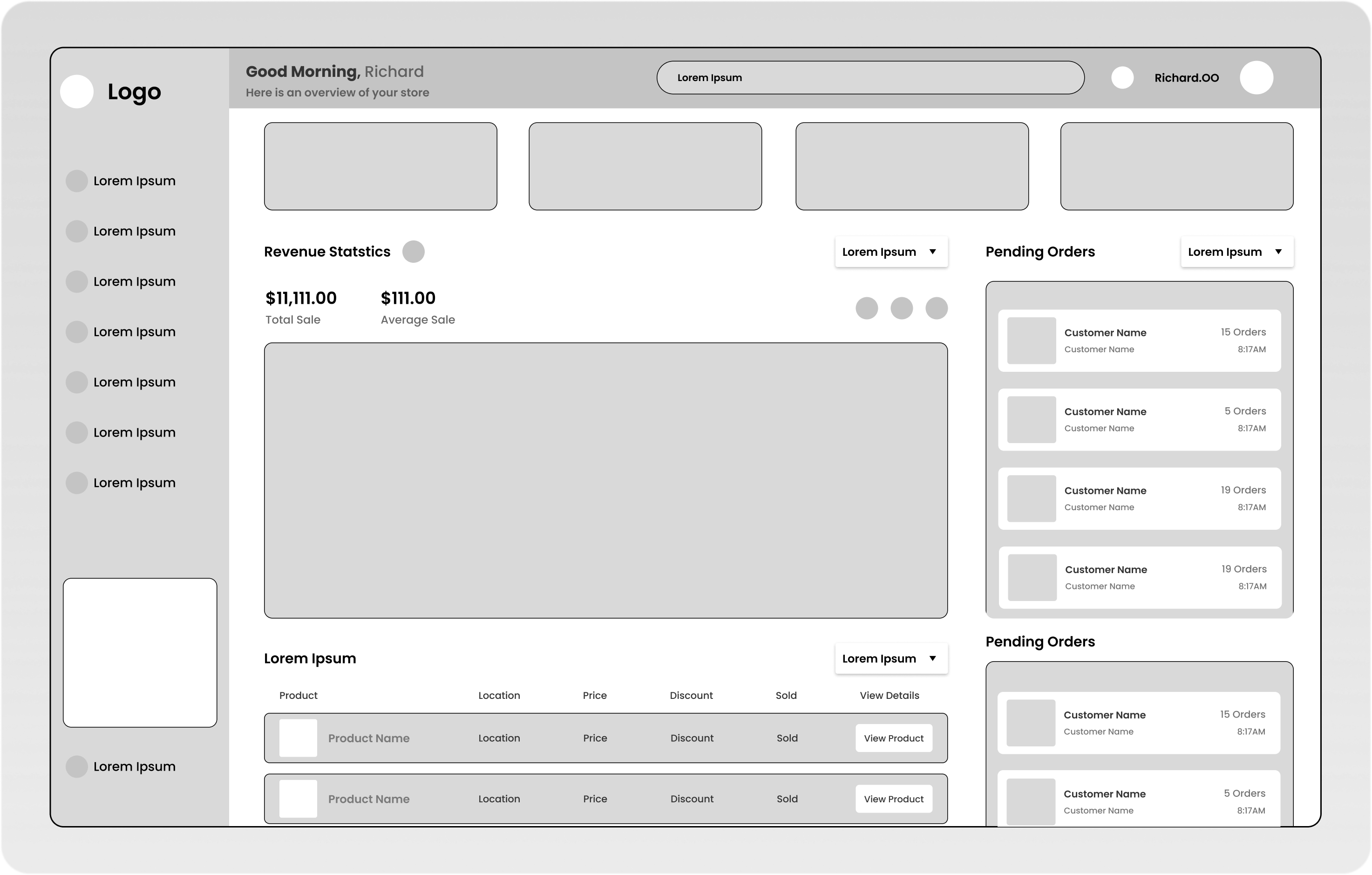
Here is the figma link to the Low-fidelity wireframe: https://www.figma.com/file/EqAW9YpgdlMMEKGgMHg0Nl/E-Com-Analytic-Web-App?node-id=20%3A1948
Design:
Grid: Using a frame of dimension (1821px x 1117px) we created a grid system of the standard 12 columns for our web app, stretching across the screen with 20px gutters between each column and a margin of 40px on both sides of our frame in order to position elements equally
Typography: After various contemplations on what user friendly fonts to use, we came up with a list of three font-families(Sora, Poppins and Inter). In which many voted on the font-family: POPPINS. We went ahead to create a typography guide with the font-weights;Regular-400, medium-500, Semi Bold- 600, Bold-700. Our typography guide can be found in the design system figma link.
Iconography: We surfed the figma community for icon packs to use for the project and ended up with a word-press icon pack with solid icons. The icon pack used can also be found in the design system link.
Color: Various shades and tints of SEA GREEN (Hex Value:428A5C) were used on the project, alongside tints of black. Which can be found in the design system figma link.
Buttons:The buttons we used for the project were created using auto-layout, we made our buttons slightly rounded in the corners with a border-radius of 4-pixel in order to create a user friendly interface.
Components: Using auto-layouts we created components (pending order card, top-product cards, etc) for easy structuring and alignment, these components can be found in the design system figma link.
We tried a retro approach to our design.
All picture assets used were downloaded from Unsplash.
Here is the figma link to the design System: https://www.figma.com/file/EqAW9YpgdlMMEKGgMHg0Nl/E-Com-Analytic-Web-App?node-id=14%3A4254
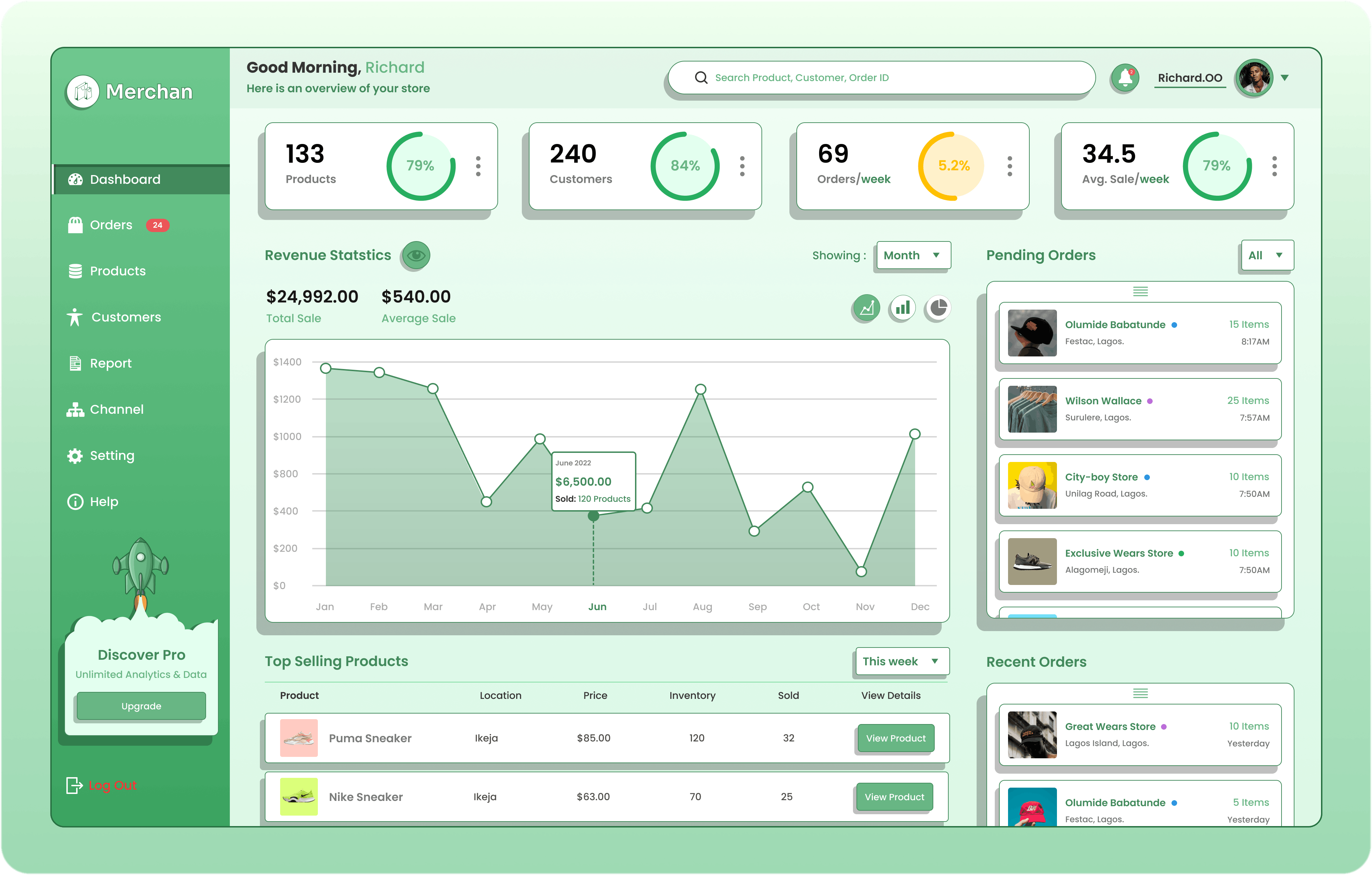
Here is the figma link to the high fidelity: figma.com/file/EqAW9YpgdlMMEKGgMHg0Nl/E-Com..
Thank you for reading, Portfolio UI-UX Team 15.