


Task Title:
Design a music player. Consider the controls, placements, imagery such as the artist or album cover, etc. Also, consider the device type that's playing the music. A dashboard in a tour bus, a smartwatch, or via a web browser. Each device type will have different requirements, features, and restrictions to consider.
Time Duration:
6 Days
Project Overview :
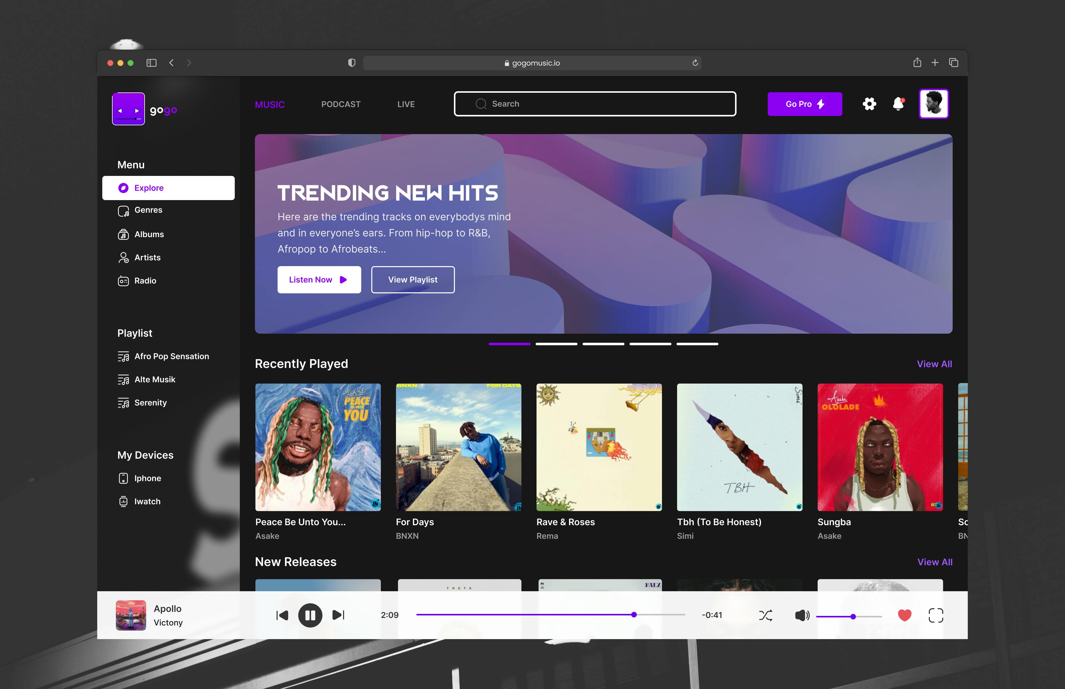
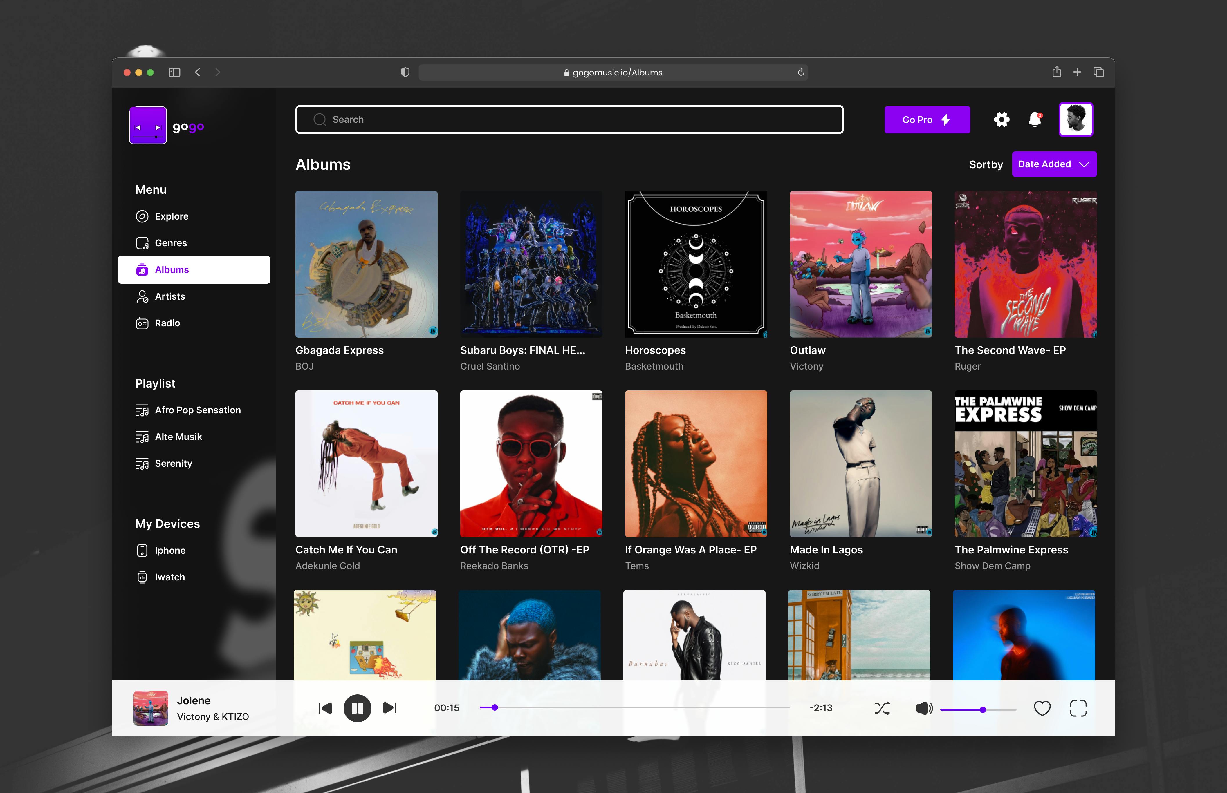
gogo is a music player that allows users to explore,choose and save various tracks, genres, albums. gogo comes in a web version, mobile version and smart watch version, allowing users to flow with their music across several devices without having to reselect playlists and songs.
Side-hustle Portfolio UI-UX Team 15 Project Members:
1.Adeloye Similoluwa 2.Balogun Sampson 3.Pelemo Olufisayo 4.Joyce Onyedikachi 5.Eghosa Mark 6.Olatunde Rasheed 7.Oyedamola Moreira 8.Precious Steven 9.Toluwani Ojo 10.Idowu Emmanuel Ayotomiwa 11.Oyedamola Moreira 12.Miriam Ango 13.Oluwaseun Ayobami
Design Process
Ideation:
SKETCH: During our task ideation stage we tabled the features needed for our music player, where we were asked to consider the music controls, placements, imagery, album covers, artist. Without forgetting the devices used. We went ahead to list out all possible features for the web and smart watch version of our music player. I decided to sketch possible ideas for the web version.
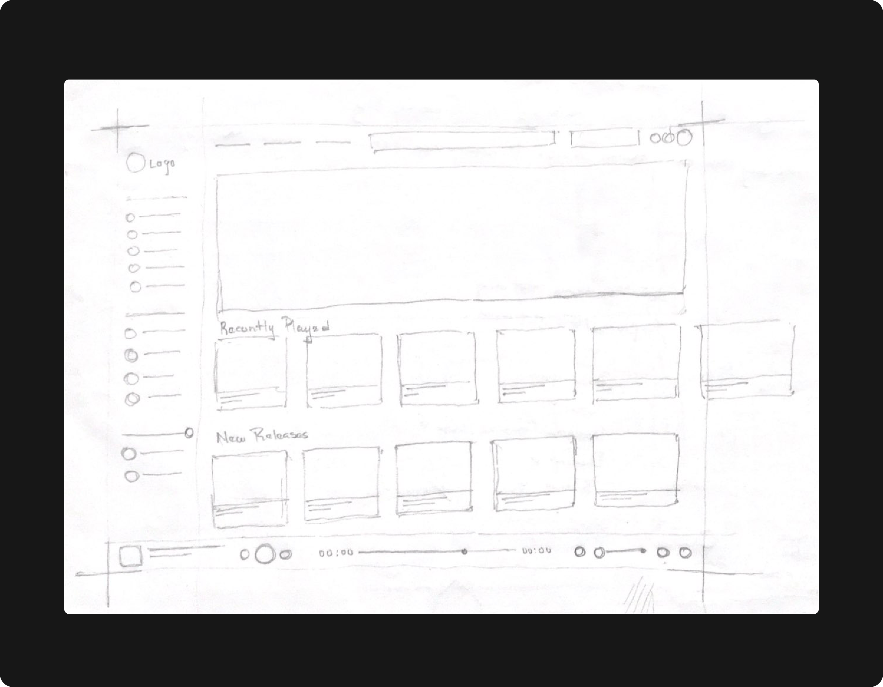
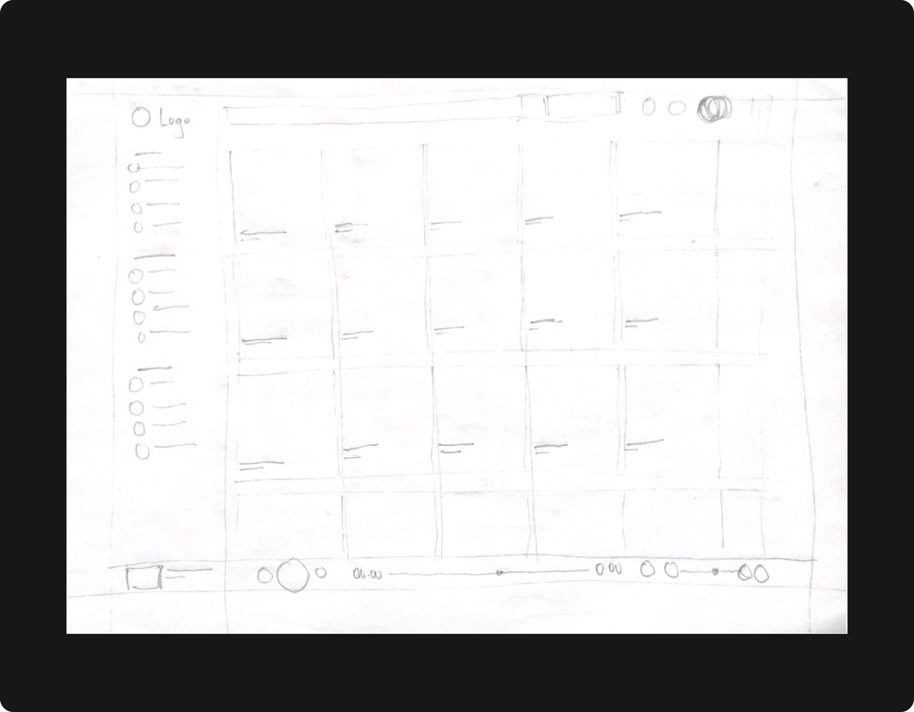
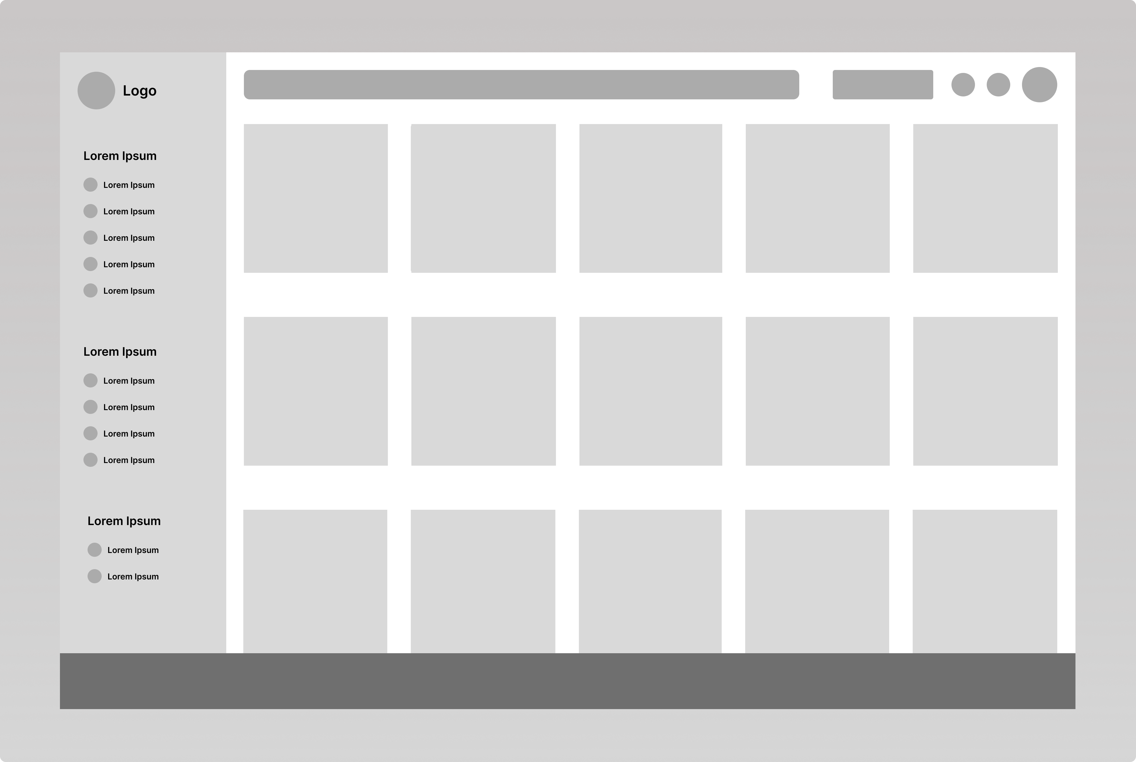
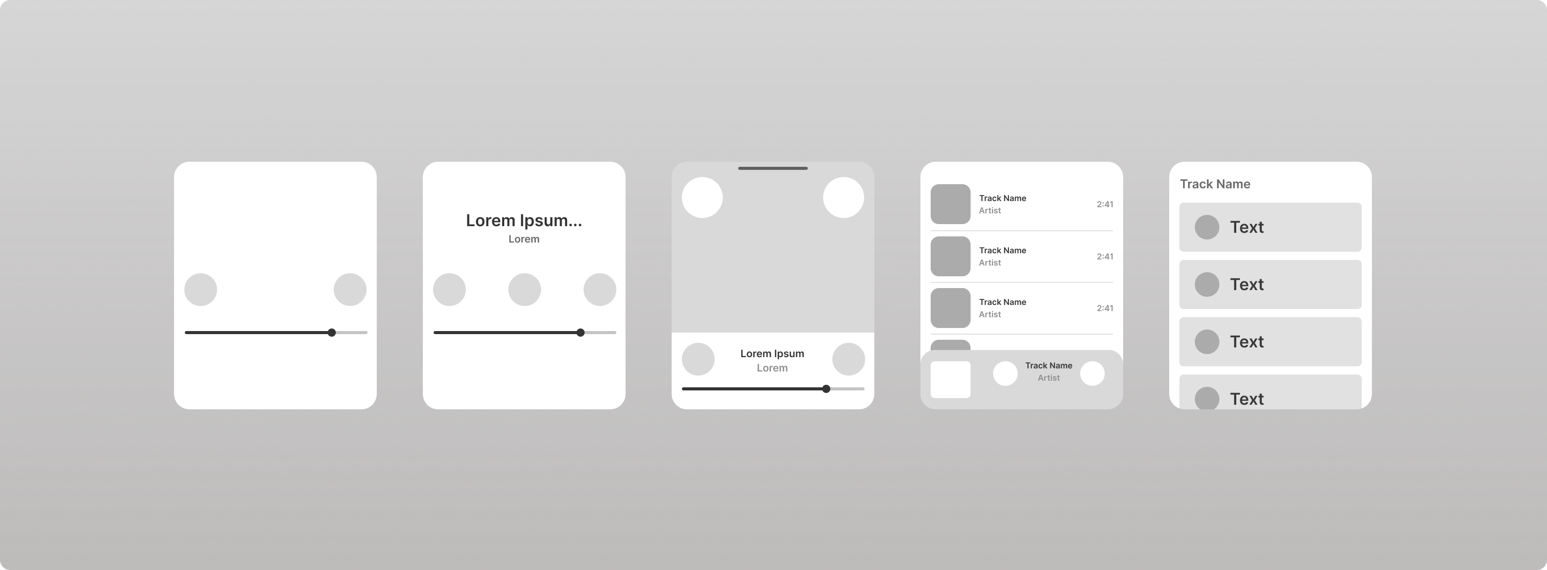
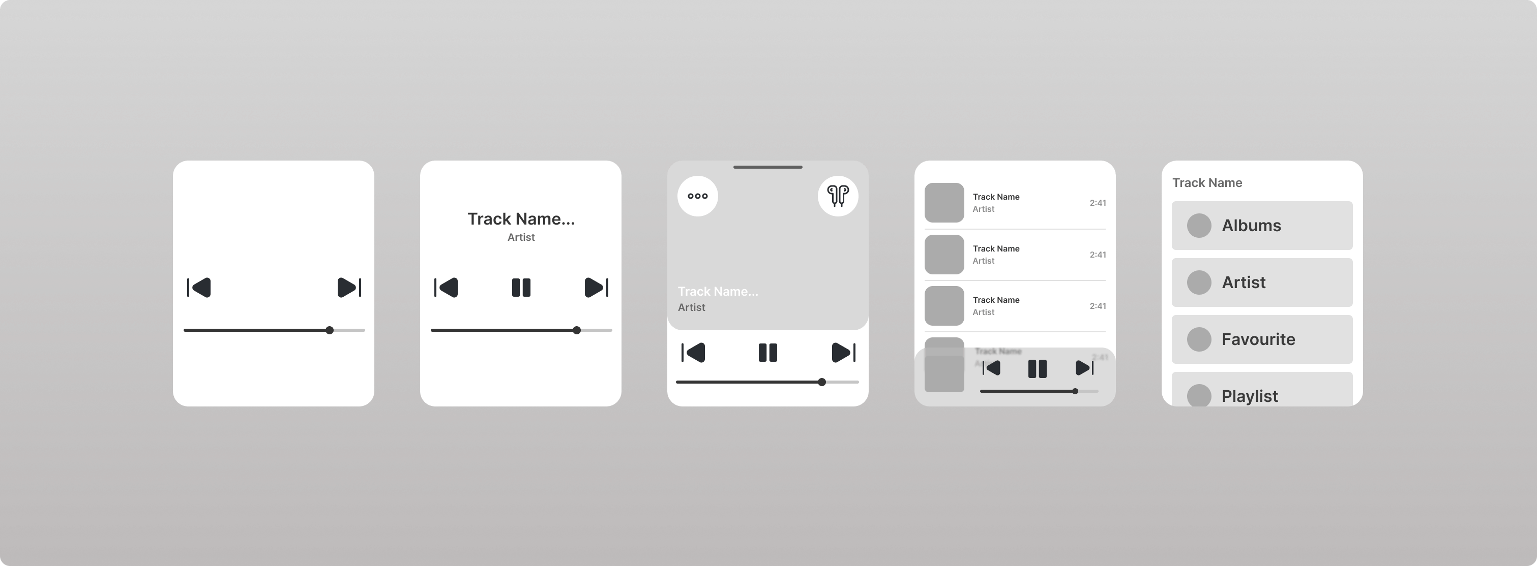
Wireframe: We designed two models of wireframes (Low Fidelity & Mid Fidelity) for the two screens of our web (The explore section screen and the albums section screen) & smart watch version .
Low Fidelity Wireframe
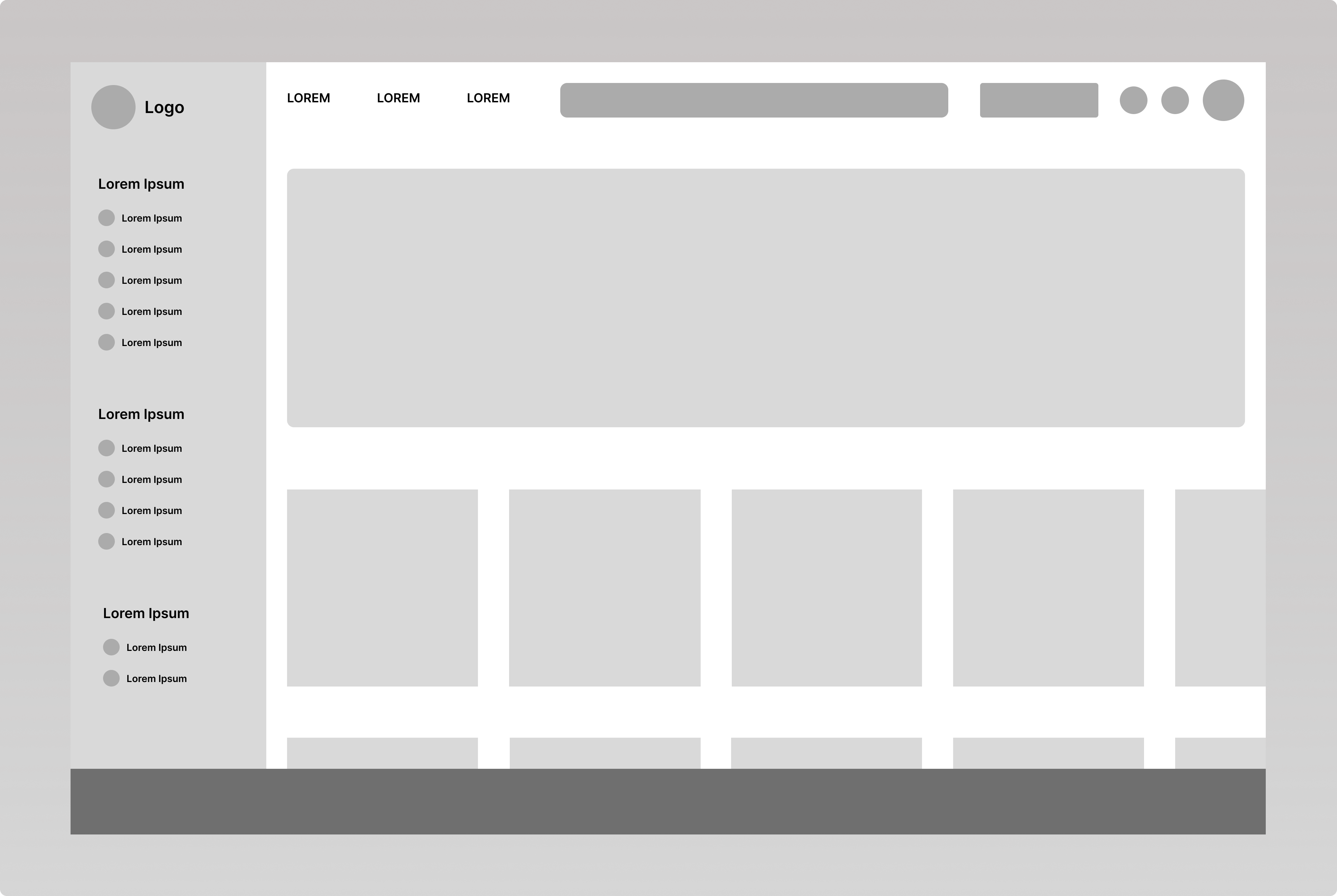
Mid Fidelity Wireframe
These wireframes can be found in this figma link: https://www.figma.com/file/3QzTctXeZVNmIgJMNVK87a/Task-4--Music-Player-SH?node-id=38%3A4015
Design
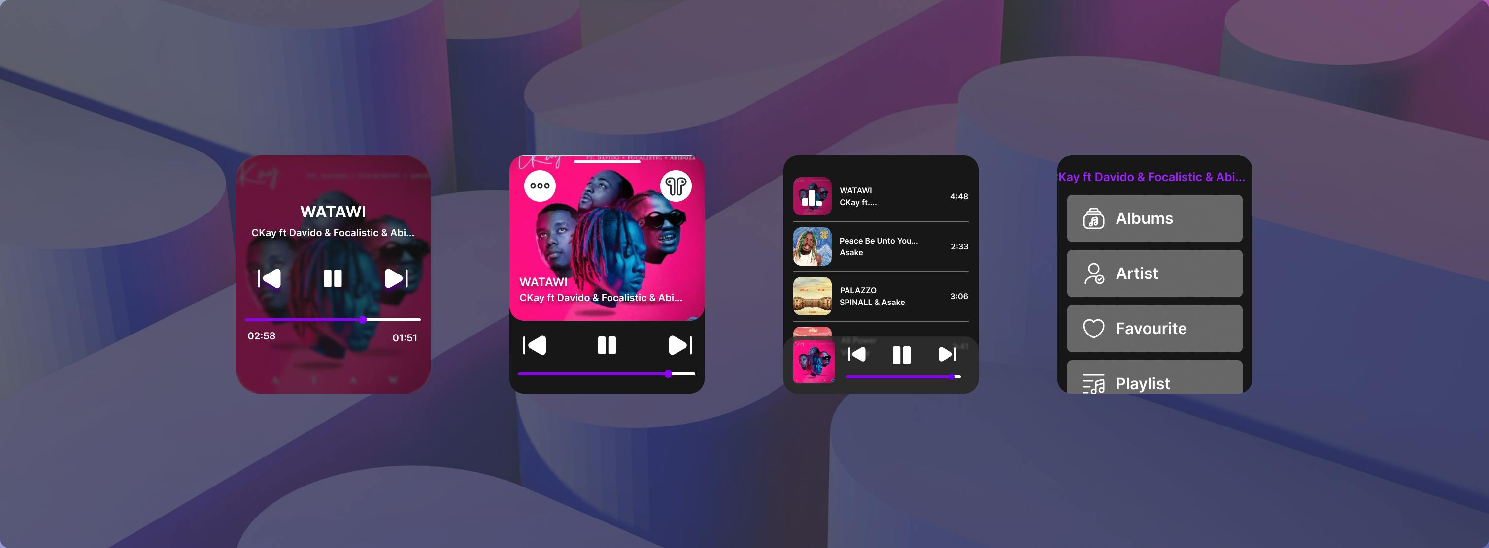
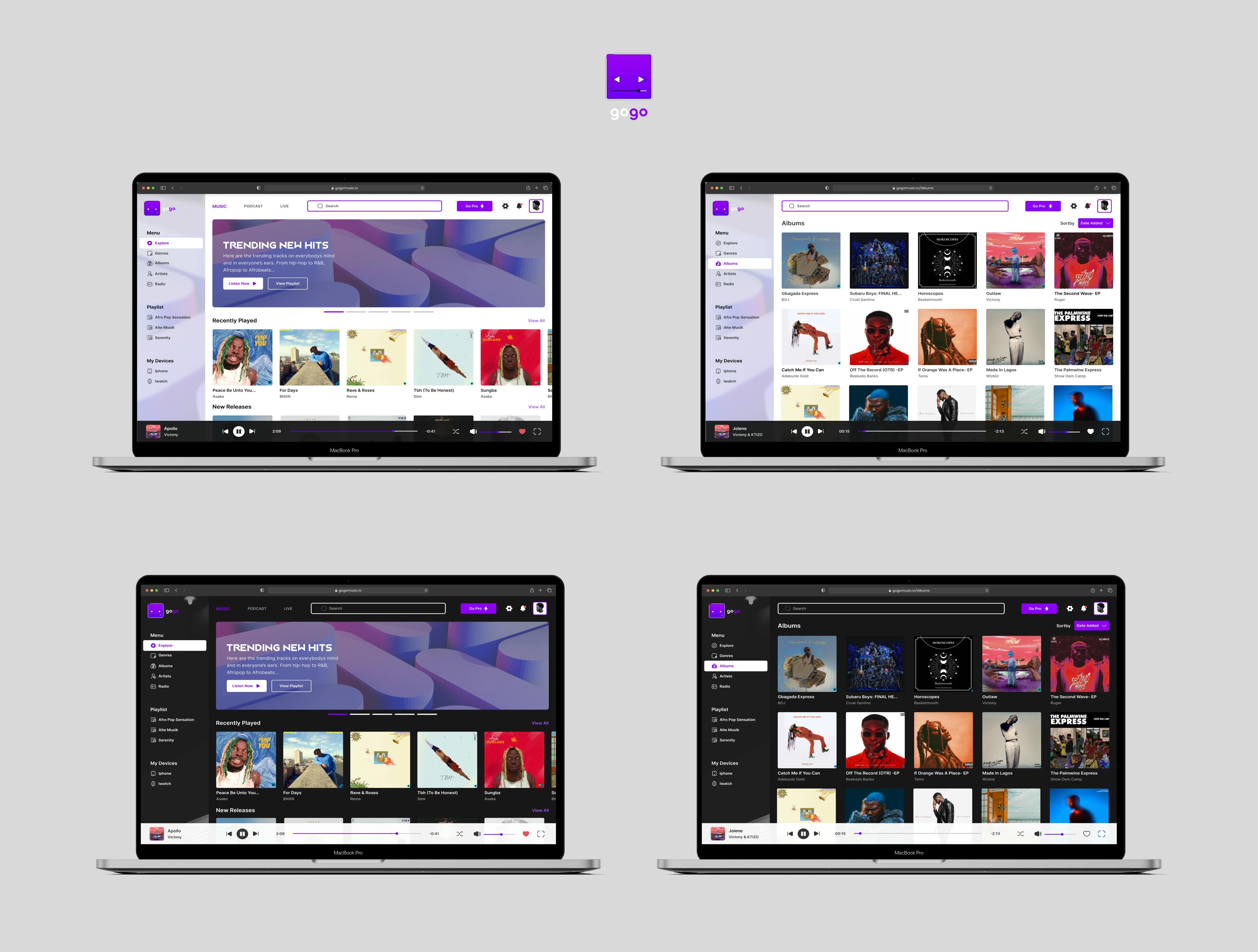
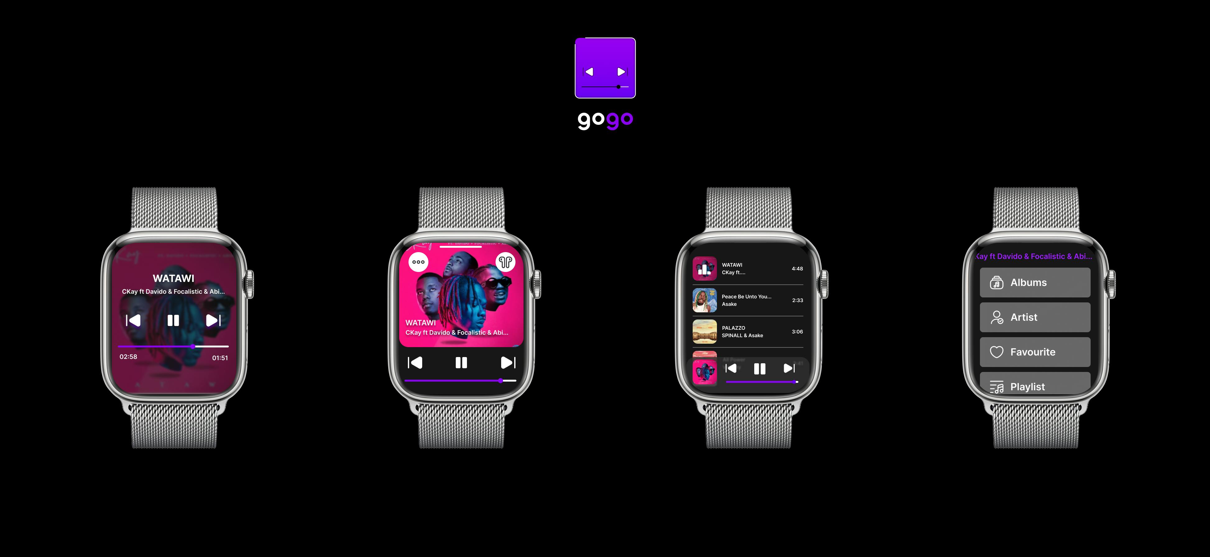
GRID-SYSTEM: Having been told to design a web and a smart watch version of our music player, we decided to make us of the frames (MacBook Pro 16" - Web Version & Apple Watch 45mm - Smart watch version). The grid system used for our web frame was a 12 column grid stretched across the frame with 20px gutter size between each column and a margin of 30px at both ends of the MacBook Pro 16" screen. Moving to our smart watch version. We used a 5 column grid stretched across the frame with 16px gutter size between each column and a margin of 10px at both ends of the Apple Watch 45mm screen.
TYPOGRAPHY: The Primary font used for our project was "INTER". Three font-weights of Inter were used for our primary fonts (Regular- 400, Medium-500 and semibold-600). Secondary Fonts- We used the font "JACK FROST" on the hero card of the explore screen, While designing our logo text we used the font "MELTIX BOLD DEMO"
ICONOGRAPHY: We made use of an Icon pack with different variations (Solid & Outline Icons), The Fine Icon pack used was gotten from the figma community (ASICON). Icons needed were arranged here: https://www.figma.com/file/3QzTctXeZVNmIgJMNVK87a/Task-4--Music-Player-SH?node-id=38%3A4014
COLOR: It was difficult coming up with a color after looking at various color palettes. We took a day off to think about this... The following day different suggestions were dropped and we concluded on using an amazing color ("ELECTRIC VIOLET" with the Hex Value: "8C01F3")
BUTTONS: Buttons used for our task were user-friendly buttons with rounded corners of 5px.
COMPONENTS: Components used can be found in this figma link: https://www.figma.com/file/3QzTctXeZVNmIgJMNVK87a/Task-4--Music-Player-SH?node-id=38%3A4014
PICTURE ASSETS: All picture assets used for this task were downloaded from Unsplash and JustNaija.com
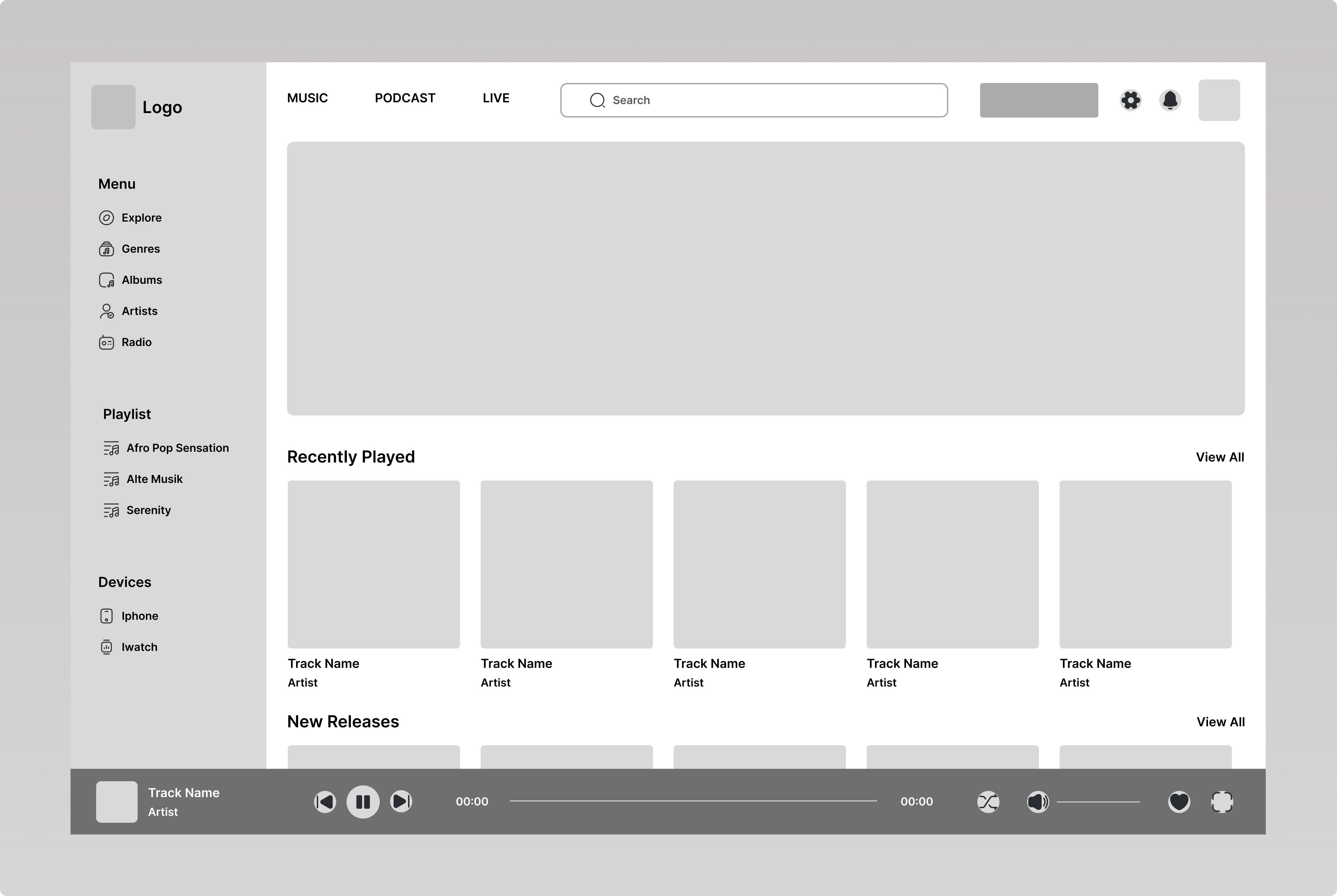
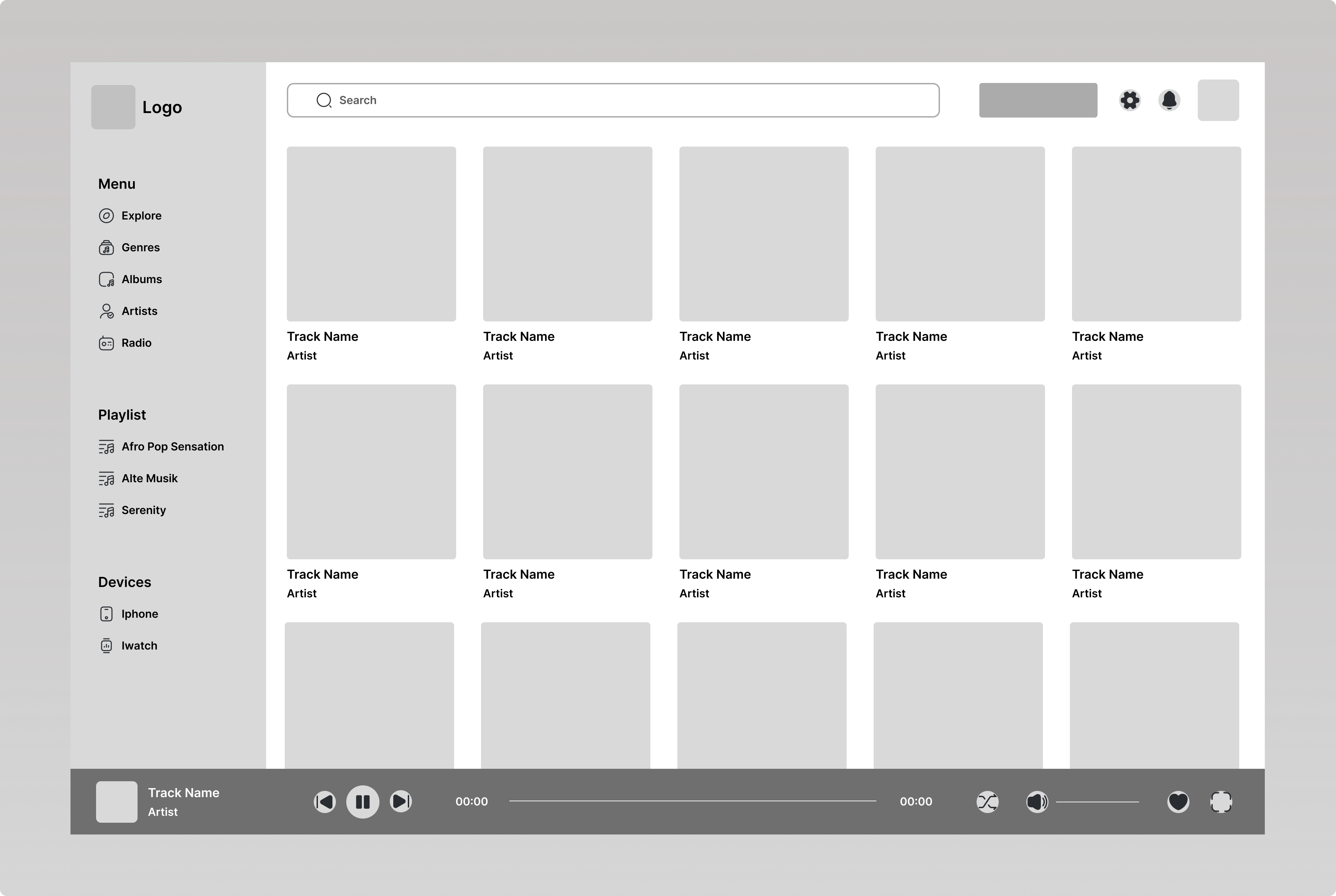
HIGH FIDELITY SCREENS :
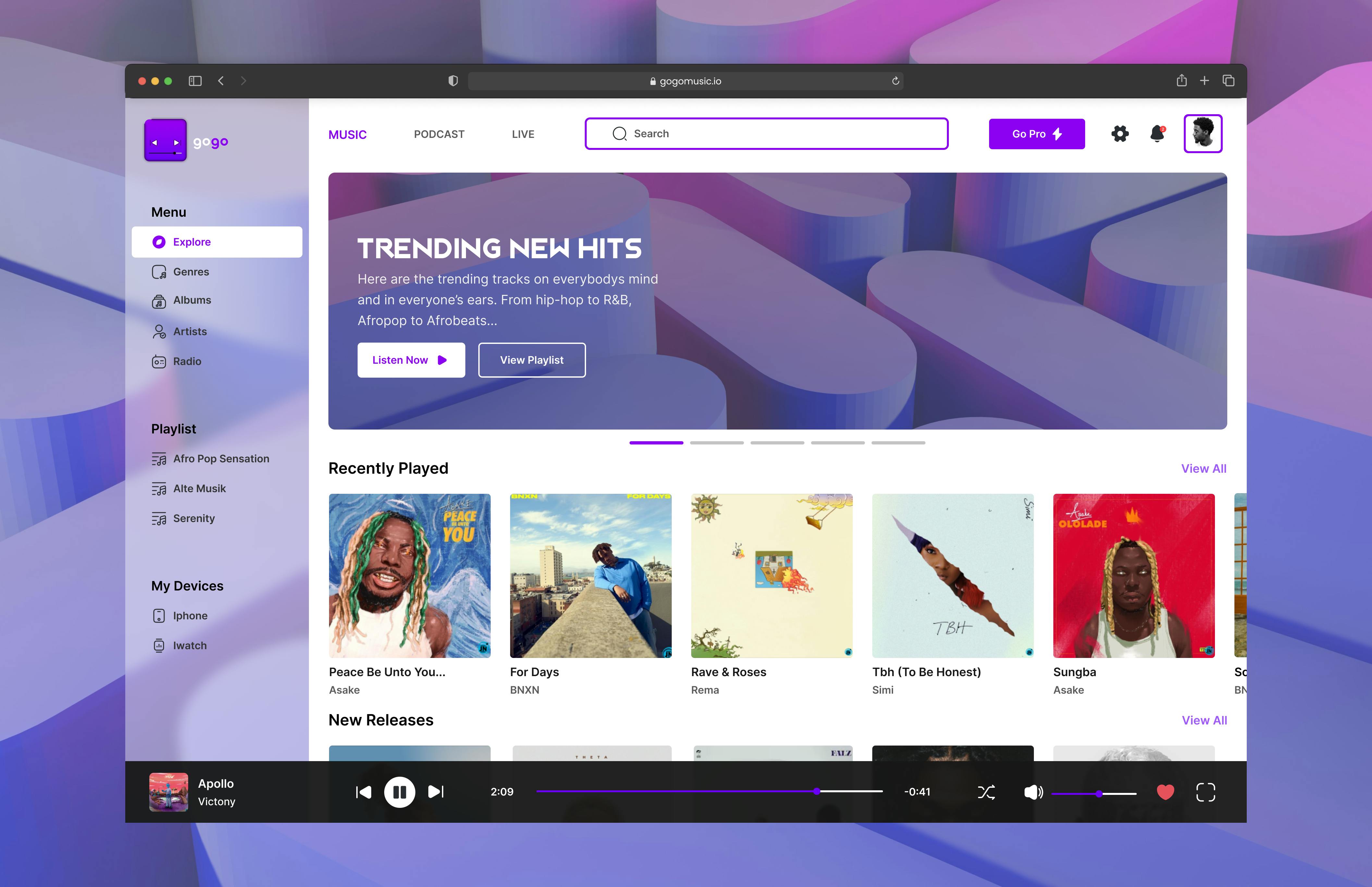
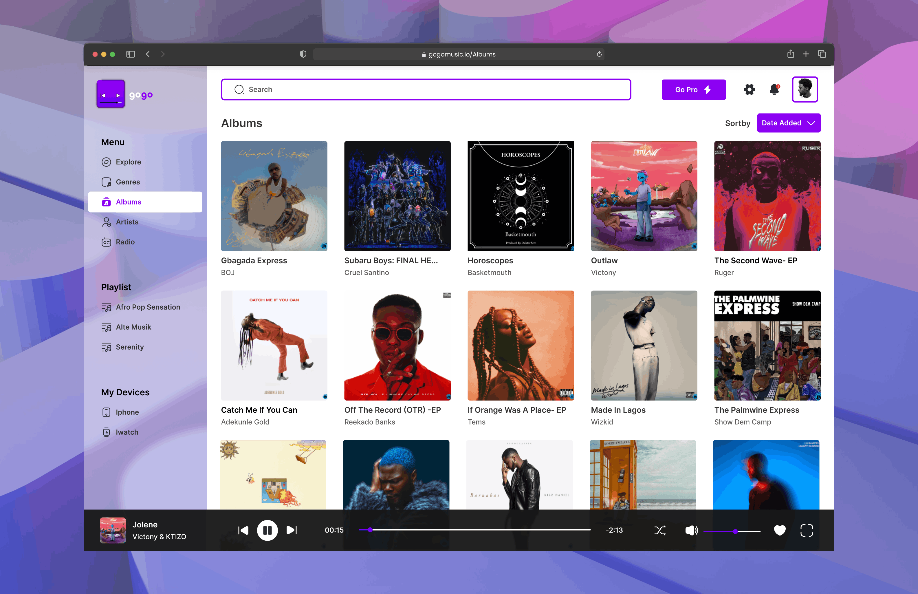
Our high fidelity screens can be found in this figma link:https://www.figma.com/file/3QzTctXeZVNmIgJMNVK87a/Task-4--Music-Player-SH?node-id=38%3A4016
DARK THEME: we also designed the dark theme of our web version
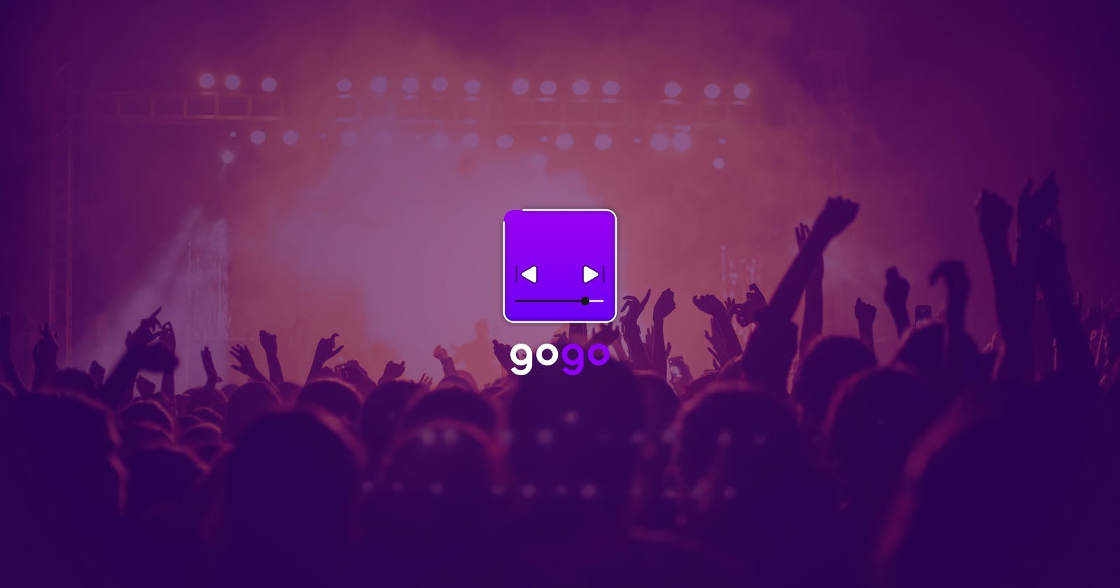
MOCKUPS: These are the Mockups of our design
Thank You For Your Time. Side-Hustle Portfolio UI-UX Team 15